S07-04 数据可视化-SVG-API
[TOC]
API-SVG
索引
基本元素
- <svg>:
width? height? xmlns? viewBox? preserveAspectRatio?,用于定义SVG的 HTML 元素。允许你在网页中嵌入和显示矢量图形内容,支持各种形状、路径、文字和渐变等图形元素。可以随浏览器的大小而缩放。 - <?xml ?>:
version encoding? standalone?,XML声明。
DOM2
- createElementNS():
(ns,elname),在指定命名空间下创建 HTML 或 SVG 元素的方法。常用于创建 SVG、MathML 或其他 XML 形式的元素。 - setAttributeNS():
(ns,attrname,value),给 SVG 元素添加属性。 - getAttributeNS():
(ns,attrname),获取 SVG 元素上的属性。 - hasAttributeNS():
(ns, attrname),判断 SVG 元素上是否存在某个属性。 - removeAttributeNS():
(ns,attrname),删除 SVG 元素上的某个属性。
属性
- fill?:
Color,设置对象填充颜色。支持颜色名、十六进制、rgb、 rgba、currentColor(继承自身或父亲字体color) - fill-opacity?:
number,用来控制填充色的不透明,值为0~1。 - stroke?:
Color,指定元素边框填充颜色。 - stroke-opacity?:
number,控制元素边框填充颜色的透明度。 - stroke-width?:
number,指定边框的宽度。注意: 边框是以路径为中心线绘制的。 - stroke-linecap?:
butt | square | round,默认:butt,控制边框端点的样式。 - stroke-linejoin?:
miter | round | bevel,默认:miter,控制两条线段连接处样式。 - stroke-dasharray?:
number [,number, ...],将虚线类型应用在边框上。值必须是用逗号分割的数字组成的数列,空格会被忽略。如3, 5,第一个表示填色区域长度为 3,第二个表示非填色区域长度为 5。 - stroke-dashoffset?:
number,指定在 dasharray 模式下路径的偏移量。值可以是正值或负值。正值向左移动,负值向右移动。 - transform:
translate() rotate() scale(),用于对元素进行变换的属性。可以平移、旋转、缩放。- translate():
(x,y?):在二维平面上平移元素。平移后会改变坐标系统。 - rotate():
(angle, cx?, cy?):在二维平面上旋转元素。旋转后会改变坐标系统。 - scale():
(x,y?):在二维平面上缩放元素。缩放后会改变坐标系统。
- translate():
绘制图形
- <rect>:
x? y? width height rx? ry? fill? stroke?,绘制矩形。 - <circle>:
cx cy r fill? stroke?,绘制圆形。 - <ellipse>:
cx cy rx ry fill? stroke?,绘制椭圆。 - <line>:
x1 y1 x2 y2 stroke stroke-width?,绘制直线。 - <polyline>:
points,绘制折线。 - <polygon>:
points,绘制多边形。 - <path>:
d,绘制路径。 - <image>:
href x? y? width? height?,绘制图片。 - <text>:
x y dx? dy? text-anchor? dominant-baseline?,绘制文本。 - <tspan>:
x y dx? dy? text-anchor? alignment-baseline?,必须是<text>或<tspan>的子元素,用于对文本进行分段处理。
组合
- <g>:
transform? fill? stroke? stroke-width? opacity? visibility? style?,用于将多个 SVG 元素组合在一起,作为一个单一的组进行处理。以便在同一位置进行变换(如平移、旋转、缩放)或者应用相同的样式或属性。
复用元素
- <defs>:
,用于定义图形对象的可重用模板,它本身不会直接渲染任何内容,而是作为一种容器。其他元素可以通过use、fill、stroke等属性引用这些定义。 - <use>:
href x? y? width? height?,用于在 SVG 中引用和复用已定义的图形、路径、渐变、符号等元素。 - <symbol>:
id viewBox? x? y? width? height?,用于定义可复用元素,和<defs>类似。可以通过<use>元素引用显示。 - <linearGradient>:
id x1? y1? x2? y2? gradientUnits? gradientTransform?,用于在指定的方向上创建一个线性渐变。 - <radialGradient>:
id cx? cy? r? fx? fy? gradientUnits? gradientTransform?,创建由中心向外辐射的径向渐变。 - <stop>:
offset stop-color stop-opacity,用于定义渐变的具体停顿点,多个<stop>元素共同定义了一个渐变的颜色过渡。 - <filter>:
id x? y? width? height?,用于应用图像滤镜效果的容器。如模糊、阴影、色彩调整等。 - <feGaussianBlur>:
in? stdDeviation result? edgeMode?,应用高斯模糊的滤镜元素。 - <feOffset>:
in? dx dy result,用于对图形的像素进行平移,常与其他滤镜元素(<feGaussianBlur>、<feComposite>等)配合使用,生成阴影或其他图形效果。
动画
- 描边动画
- el.getTotalLength():
(),计算路径元素总长度(以用户单位为单位)的浮点数。 - SMIL动画
- <set>:
attributeName to begin? dur? attributeType?,用于在给定的时间内动态地更改元素的属性值。是最简单的SVG动画元素。 - <animate>:
attributeName from? to? values? begin? dur? fill? repeatCount?,用于对一个或多个 SVG 图形元素的属性值进行动画过渡。 - <animateTransform>:
attributeName from? to values? begin? dur fill? repeatCount?,指定目标元素的形变。 - <animateMotion>:
path rotate,定义一个元素沿指定的路径进行运动。
基本元素
svg
<svg>:width? height? xmlns? viewBox? preserveAspectRatio?,用于定义SVG的 HTML 元素。允许你在网页中嵌入和显示矢量图形内容,支持各种形状、路径、文字和渐变等图形元素。可以随浏览器的大小而缩放。
width?、height?:
number,默认:300 150,定义 SVG 图形的显示区域的宽度和高度。单位是px或%,不带单位。xmlns?:
string,XML 命名空间,如http://www.w3.org/2000/svgviewBox?:
min-x min-y width height,视图框,定义用户坐标系的位置和尺寸。使图形可以自适应容器大小,同时保持图形比例。- minx miny:
number,number,确定视图框的左上角坐标,不是修改用户坐标系的原点,绘图还是从原来的 0, 0 开始。 - width height:
number,number,确定视图框的宽度和高度。- 宽度和高度不必与父
<svg>元素上设置的宽度和高度相同。 - 宽度和高度负值无效,为 0 是禁用元素的显示。
- 宽度和高度不必与父
- minx miny:
preserveAspectRatio?:
align meetOrSlice,默认:xMidYMid,定义如何在缩放时保持图形的宽高比例。- align:
xMinYMin | xMidYMid... | none,表示是否强制统一缩放以及统一缩放后的对齐方式。xMinYMin:图形保留左上角对齐。xMidYMid:默认,图形在容器中居中显示。none:不强制统一缩放,图形会拉伸填满容器。
- meetOrSlice?:
meet | slice,默认:meet。meet:宽高比将会被保留;整个 SVG 的 viewbox 在视口范围内是可见的;尽可能的放大 SVG 的 viewbox,同时仍然满足其他的条件。slice:宽高比将会被保留;整个视口将覆盖 viewbox;SVG 的 viewbox 属性将会被尽可能的缩小,但是仍然符合其他标准。
- align:
- html
<svg width="200" height="200" xmlns="http://www.w3.org/2000/svg" viewBox="0 0 100 100" preserveAspectRatio="xMidYMid">
  <circle cx="50" cy="50" r="40" fill="blue" />
</svg>
xml
<?xml ?>:version encoding? standalone?,XML声明。
version :
1.0 | 1.1,常用:1.0,指定 XML 文档的版本。encoding? :
encoding string,默认:UTF-8,指定 XML 文档的字符编码。standalone?:
yes | no,默认:no,指定 XML 文档是否独立于外部 DTD。需和 DTD 声明一起使用。- html
<?xml version="1.0" encoding="UTF-8" standalone="no"?>
<note>
  <to>Tove</to>
  <from>Jani</from>
  <heading>Reminder</heading>
  <body>Don't forget me this weekend!</body>
</note>
DOM2
createElementNS()
createElementNS():(ns,elname),在指定命名空间下创建 HTML 或 SVG 元素的方法。常用于创建 SVG、MathML 或其他 XML 形式的元素。
ns:
string,指定元素的命名空间。如http://www.w3.org/2000/svg。elname:
string,元素的名称(标签名)。返回:
el:
Element,返回一个新创建的元素节点。- js
// 获取 SVG 容器
var svgNS = "http://www.w3.org/2000/svg"; // SVG 命名空间

// 创建一个 <svg> 元素
var svgElement = document.createElementNS(svgNS, "svg");
svgElement.setAttribute("width", "200");
svgElement.setAttribute("height", "200");
setAttributeNS()
setAttributeNS():(ns,attrname,value),给 SVG 元素添加属性。
ns:
string,指定元素的命名空间。attrname:
string,属性的完全限定名称(包含命名空间前缀)。格式:prefix:localName。value:
string,要设置的属性值。- js
// 使用命名空间 'xlink' 来设置 'xlink:href' 属性
link.setAttributeNS('http://www.w3.org/1999/xlink', 'xlink:href', 'https://www.example.co
getAttributeNS()
getAttributeNS():(ns,attrname),获取 SVG 元素上的属性。
ns:
string,指定属性的命名空间。若没有,则传入nullattrname:
string,属性的完全限定名称(包含命名空间前缀)。格式:prefix:localName。返回:
value:
string,返回属性的值,没有则返回null。- js
// 获取带命名空间的属性
var xValue = rect.getAttributeNS('http://www.w3.org/2000/svg', 'x');
hasAttributeNS()
hasAttributeNS():(ns, attrname),判断 SVG 元素上是否存在某个属性。
ns:
string,指定属性的命名空间。若没有,则传入nullattrname:
string,属性的完全限定名称(包含命名空间前缀)。格式:prefix:localName。返回:
hasAttr:
boolean,返回是否存在该属性。- js
// 检查是否存在 x 属性(属于 SVG 命名空间)
var hasX = rect.hasAttributeNS('http://www.w3.org/2000/svg', 'x');
console.log('Has "x" attribute:', hasX);  // 输出: true

// 检查是否存在某个不在该命名空间中的属性
var hasWidth = rect.hasAttributeNS('http://www.w3.org/2000/svg', 'width');
console.log('Has "width" attribute:', hasWidth);  // 输出: true
removeAttributeNS()
removeAttributeNS():(ns,attrname),删除 SVG 元素上的某个属性。
ns:
string,指定属性的命名空间。若没有,则传入nullattrname:
string,属性的完全限定名称(包含命名空间前缀)。格式:prefix:localName。- js
  var rect = document.getElementById('myRect');

  // 移除 x 属性
  rect.removeAttributeNS('http://www.w3.org/2000/svg', 'x');

  // 输出:移除后,x 属性应该不存在
  console.log(rect.getAttributeNS('http://www.w3.org/2000/svg', 'x')); // 输出: null
绘制图形
rect
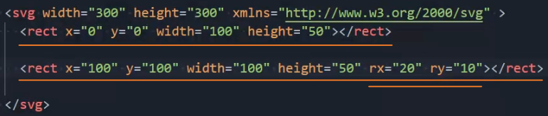
<rect>:x? y? width height rx? ry? fill? stroke?,绘制矩形。
x? y?:
number,矩形左上角的x轴、y轴坐标。width height:
number,矩形的宽度和高度。rx? ry?:
number,矩形圆角的x轴、y轴方向的半径。fill? stroke?:``,统一属性。
circle
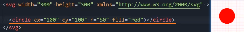
<circle>:cx cy r fill? stroke?,绘制圆形。
- cx cy:
number,圆心的x轴、y轴坐标。 - r:
number,圆的半径。 - fill? stroke?:``,统一属性。
ellipse
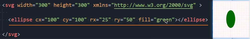
<ellipse>:cx cy rx ry fill? stroke?,绘制椭圆。
- cx cy:
number,椭圆圆心的x轴、y轴坐标。 - rx ry:
number,椭圆的x轴、y轴半径。 - fill? stroke?:``,统一属性。
line
<line>:x1 y1 x2 y2 stroke stroke-width?,绘制直线。
- x1 y1:
number,直线起点的x轴、y轴坐标。 - x2 y2:
number,直线终点的x轴、y轴坐标。 - stroke:
Color,给直线描边并设置描边颜色。 - stroke-width?:
number,设置描边粗细。 - 注意: 绘制线条时必须使用
stroke来描边,否则线条不能显示,不能使用fill属性填充。 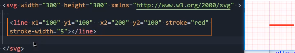
polyline
<polyline>:points,绘制折线。
- points:
点集数列,点集数列。每个数字用空白、逗号、终止命令符或者换行符分隔开。 - fill? stroke?:``,统一属性。
- 注意: 点集数列中每个点必须包含 2 个数字:x坐标,y坐标。
- 注意: 支持格式:
0 0, 1 1, 2 2(推荐)或0, 0, 1, 1, 2, 2或0 0 1 1 2 2。 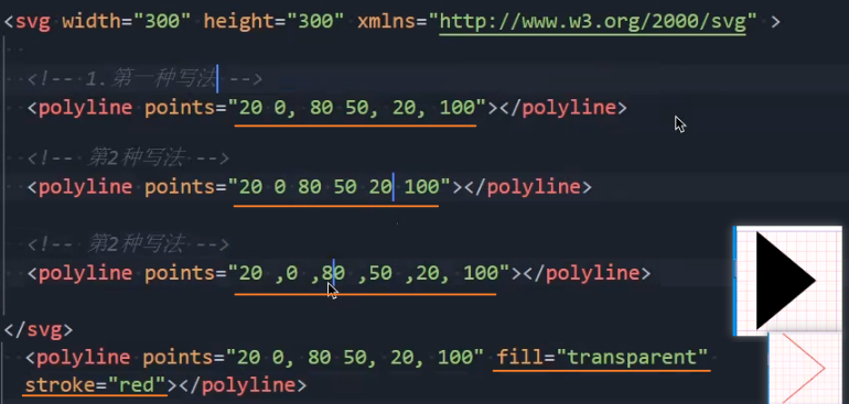
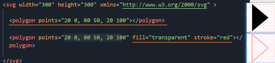
polygon
<polygon>:points,绘制多边形。
- points:
点集数列,点集数列。每个数字用空白、逗号、终止命令符或者换行符分隔开。 - fill? stroke?:``,统一属性。
- 注意: 点集数列中每个点必须包含 2 个数字:x坐标,y坐标。
- 注意: 支持格式:
0 0, 1 1, 2 2(推荐)或0, 0, 1, 1, 2, 2或0 0 1 1 2 2。 - 注意: 对比polyline,polygon会在路径的最后一点处自动闭合。
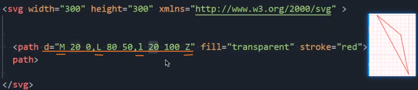
path
<path>:d,绘制路径。
- d:
点集数列,定义路径的数据。常用的路径命令:直线命令:
M / m:移动到(Move To),如d="M 10 10"。L / l:画直线到(Line To),如d="M 10 10 L 50 50"。H / h:水平直线到(Horizontal Line To),如d="M 10 10 H 100"。V / v:垂直直线到(Vertical Line To),如d="M 10 10 V 100"。
曲线命令:
C / c:三次贝塞尔曲线到(Cubic Bezier Curve To),如d="M 10 10 C 20 20, 30 20, 40 10"。S / s:平滑三次贝塞尔曲线到(Smooth Cubic Bezier Curve To),如d="M 10 10 C 20 20, 30 20, 40 10 S 50 0, 60 10"。Q /q:二次贝塞尔曲线到(Quadratic Bezier Curve To),如d="M 10 10 Q 20 20, 30 10"。T / t:平滑二次贝塞尔曲线到(Smooth Quadratic Bezier Curve To),如d="M 10 10 Q 20 20, 30 10 T 50 0"。
圆弧命令:
A / a:圆弧曲线到(Elliptical Arc Curve To),如d="M 10 10 A 50 50 0 0 1 100 10"。
闭合命令:
Z / z:闭合路径(Close Path),如d="M 10 10 L 50 50 L 90 10 Z"。
- fill? stroke?:``,统一属性。
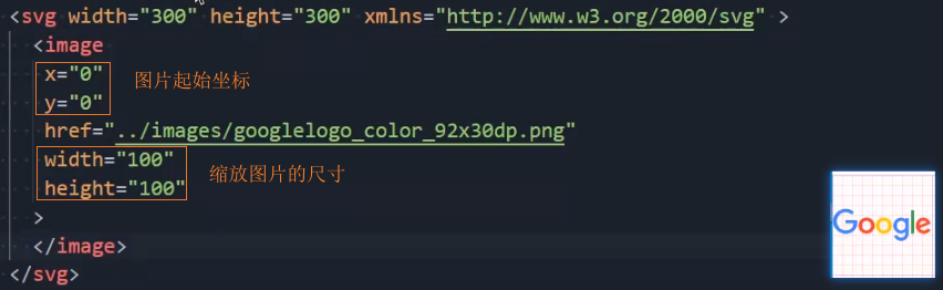
image
<image>:href x? y? width? height?,绘制图片。
- href:
URLString,图像的路径。 - x? y?:
number,默认:0 0,图像起始位置的x轴、y轴坐标。 - width? height?:
number,默认:图片的宽高,图像的宽度和高度。 - 注意: 对比HTML的
<img>元素,使用href而非src引入图片路径。 - 兼容: 可以同时使用 xlink:href 兼容以前的浏览器。
text
<text>:x y dx? dy? text-anchor? dominant-baseline?,绘制文本。
- 位置:
- x y:
number,文本起始的x轴、y轴坐标。 - dx? dy?:
number,设置文本相对于当前位置(x y)的偏移量。 - 对齐:
- text-anchor:
start | middle | end,默认:start,设置文本的对齐方式。相当于text-align。 - dominant-baseline:
auto | middle | hanging,默认:auto,设置文本的基线对齐方式。 - 字体的CSS属性: font-family、font-style、font-weight、font-variant、font-stretch、font-size、font-size-adjust、kerning、letter-spacing、word-spacing 和 text-decoration。
- fill?:
Color,设置字体的颜色,此处不能使用color属性。 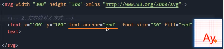
tspan
<tspan>:x y dx? dy? text-anchor? alignment-baseline?,必须是<text>或<tspan>的子元素,用于对文本进行分段处理。
- 属性: 基本和
<text>一致。 - 对比
<text>: 基线对齐属性使用alignment-baseline,而非dominant-baseline。 - alignment-baseline:
auto | middle | hanging,默认:auto,设置文本的基线对齐方式。 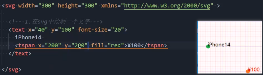
组合
g
<g>:transform? fill? stroke? stroke-width? opacity? visibility? style? ,用于将多个 SVG 元素组合在一起,作为一个单一的组进行处理。以便在同一位置进行变换(如平移、旋转、缩放)或者应用相同的样式或属性。
- 属性: 该元素只包含全局属性,没有专有的属性。
- transform?:
translate()? rotate()? scale()?,对组内的所有元素应用一个统一的形变。 - fill? stroke? stroke-width?:
Color Color number,一次性为组内的所有子元素应用相同的样式。 - opacity?:
number,设置组内所有元素的不透明度。 - visibility?:
hidden | visiable,设置组内元素的可见性。 - style?:
CSSString,为组内所有元素应用内联 CSS 样式。 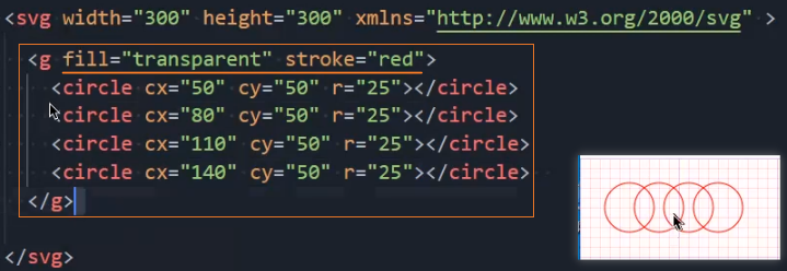
复用元素
defs
<defs>:,用于定义图形对象的可重用模板,它本身不会直接渲染任何内容,而是作为一种容器。其他元素可以通过 use、fill、stroke 等属性引用这些定义。
属性: 没有专有的属性。
- html
<svg width="200" height="200">
  <defs>
    <!-- 定义渐变 -->
    <linearGradient id="grad1" x1="0%" y1="0%" x2="100%" y2="100%">
      <stop offset="0%" style="stop-color:rgb(255,255,0);stop-opacity:1" />
      <stop offset="100%" style="stop-color:rgb(255,0,0);stop-opacity:1" />
    </linearGradient>

    <!-- 定义图案 -->
    <pattern id="pattern1" patternUnits="userSpaceOnUse" width="10" height="10">
      <circle cx="5" cy="5" r="4" style="stroke:none; fill:blue" />
    </pattern>

    <!-- 定义滤镜 -->
    <filter id="f1" x="0" y="0" width="150%" height="150%">
      <feGaussianBlur in="SourceGraphic" stdDeviation="15" />
    </filter>

    <!-- 定义剪辑路径 -->
    <clipPath id="clip1">
      <circle cx="100" cy="100" r="50" />
    </clipPath>

    <!-- 定义掩模 -->
    <mask id="mask1" x="0" y="0" width="200" height="200">
      <rect width="100%" height="100%" fill="white" />
      <circle cx="100" cy="100" r="50" fill="black" />
    </mask>

    <!-- 定义可重用图形 -->
    <symbol id="triangle" viewBox="0 0 100 100">
      <polygon points="50,15 100,85 0,85" fill="green" />
    </symbol>
  </defs>

  <!-- 使用定义的渐变 -->
  <rect width="200" height="200" fill="url(#grad1)" />
</svg>
use
<use>:href x? y? width? height? ,用于在 SVG 中引用和复用已定义的图形、路径、渐变、符号等元素。
href:
string,指定引用的元素的 ID。不能使用class名。xlink:href?:
string,href的SVG1.0兼容写法。x? y?:
number,默认:0 0,指定引用元素的坐标。该坐标相对于复制元素的位置。width? height?:
number,默认:引用元素的原始大小,引用元素的宽和高。只有在引入svg或symbol元素时才会生效,因为它们有viewBox属性。注意: 从SVG2开始,
x y width height成为了Geometry Properties,可以同时在css或<use>元素上使用。注意: use可以跨svg引入定义的图形。
- html
<svg width="200" height="200">
  <defs>
    <linearGradient id="grad1" x1="0%" y1="0%" x2="100%" y2="100%">
      <stop offset="0%" style="stop-color:rgb(255,255,0);stop-opacity:1" />
      <stop offset="100%" style="stop-color:rgb(255,0,0);stop-opacity:1" />
    </linearGradient>
  </defs>

  <!-- 使用渐变 -->
  <use href="#grad1" x="10" y="10" width="180" height="180" fill="url(#grad1)" />
</svg>
symbol
<symbol>:id viewBox? x? y? width? height?,用于定义可复用元素,和<defs>类似。可以通过<use>元素引用显示。
id:
string,id属性。use引用需用到。viewBox?:
min-x min-y width height,视图框,定义用户坐标系的位置和尺寸。使图形可以自适应容器大小,同时保持图形比例。- minx miny:
number,确定视图框的左上角坐标,不是修改用户坐标系的原点,绘图还是从原来的 0, 0 开始。 - width height:
number,确定视图框的宽度和高度。- 宽度和高度不必与父
<svg>元素上设置的宽度和高度相同。 - 宽度和高度负值无效,为 0 是禁用元素的显示。
- 宽度和高度不必与父
- minx miny:
x? y?:
number,默认:0 0,symbol元素的x轴、y轴坐标。width? height?:
number,symbol 元素的宽度和高度。- html
<svg width="200" height="200">
  <!-- 定义可重用图形 -->
  <symbol id="triangle" viewBox="0 0 100 100">
    <polygon points="50,15 100,85 0,85" fill="green" />
  </symbol>

  <!-- 复用symbol定义的图形 -->
  <use href="#triangle" width="100" height="100">
</svg>
linearGradient
<linearGradient>:id x1? y1? x2? y2? gradientUnits? gradientTransform?,用于在指定的方向上创建一个线性渐变。
id:
string,用于标识渐变的唯一名称,可以在其他地方引用。x1? y1?:
number number,默认:0%, 0%,渐变起始点的坐标。x2? y2?:
number number,默认:100%, 0%,渐变结束点的坐标。gradientUnits?:
userSpaceOnUse | objectBoundingBox,默认:objectBoundingBox,指定渐变的坐标系统。userSpaceOnUse:渐变的坐标相对于用户空间,即基于整个画布的坐标系。objectBoundingBox:渐变的坐标相对于所应用的元素边界框(即元素的大小和位置)。
gradientTransform?:
translate() rotate() scale(),对渐变应用形变。- html
<svg width="200" height="100">
  <defs>
    <linearGradient id="grad1" x1="0%" y1="0%" x2="100%" y2="0%">
      <stop offset="0%" style="stop-color: red; stop-opacity: 1" />
      <stop offset="100%" style="stop-color: blue; stop-opacity: 1" />
    </linearGradient>
  </defs>

  <rect x="10" y="10" width="180" height="80" fill="url(#grad1)" />
</svg>
radialGradient
<radialGradient>:id cx? cy? r? fx? fy? gradientUnits? gradientTransform? ,创建由中心向外辐射的径向渐变。
id:
string,用于标识渐变的唯一名称,可以在其他地方引用。cx? cy?:
number number,默认:50% 50%,渐变中心圆点的x、y轴坐标。r?:
number,默认:50%,渐变的半径。fx? fy?:
number number,默认:50% 50%,渐变焦点的x、y轴坐标。gradientUnits?:
userSpaceOnUse | objectBoundingBox,默认:objectBoundingBox,指定渐变的坐标系统。userSpaceOnUse:渐变的坐标相对于用户空间,即基于整个画布的坐标系。objectBoundingBox:渐变的坐标相对于所应用的元素边界框(即元素的大小和位置)。
gradientTransform?:
translate() rotate() scale(),对渐变应用形变。- html
<svg width="200" height="200" xmlns="http://www.w3.org/2000/svg">
  <defs>
    <radialGradient id="grad3" cx="50%" cy="50%" r="50%" fx="50%" fy="50%" gradientTransform="rotate(45)">
      <stop offset="0%" stop-color="purple" stop-opacity="1"/>
      <stop offset="100%" stop-color="orange" stop-opacity="1"/>
    </radialGradient>
  </defs>

  <circle cx="100" cy="100" r="80" fill="url(#grad3)" />
</svg>
stop
<stop>:offset stop-color stop-opacity,用于定义渐变的具体停顿点,多个 <stop> 元素共同定义了一个渐变的颜色过渡。
offset:
number | %,数字从0~1,颜色停顿点在渐变中的相对位置。stop-color:
Color,当前停顿点的颜色。stop-opacity:
number,数字从0~1,定义该停顿点的透明度。- html
<svg width="300" height="100">
  <defs>
    <linearGradient id="grad2" x1="0%" y1="0%" x2="100%" y2="0%">
      <stop offset="0%" stop-color="red" stop-opacity="1" />
      <stop offset="50%" stop-color="yellow" stop-opacity="0.5" />
      <stop offset="100%" stop-color="green" stop-opacity="0" />
    </linearGradient>
  </defs>

  <rect x="10" y="10" width="280" height="80" fill="url(#grad2)" />
</svg>
filter
<filter>:id x? y? width? height?,用于应用图像滤镜效果的容器。如模糊、阴影、色彩调整等。
id:
string,过滤器的唯一标识符,可以在其他地方引用。x? y?:
number number,默认:-10% -10%,定义过滤器区域的左上角坐标。width? height?:
number number,默认:120% 120%,定义过滤器区域的宽度和高度。- html
<!-- 高斯模糊 -->
<svg width="200" height="200">
  <defs>
    <filter id="blurEffect">
      <!-- 高斯模糊:SourceGraphic、SourceAlpha -->
      <feGaussianBlur in="SourceGraphic" stdDeviation="5" />

      <!-- 阴影 -->
      <feOffset in="SourceAlpha" dx="5" dy="5" result="offsetImage" />

      <!-- 混合模式:normal、multiply、screen -->
      <feBlend in="SourceGraphic" in2="blurredImage" mode="multiply" result="blendedImage" />

      <!-- 颜色处理:色相、饱和度、自定义矩阵 -->
      <feColorMatrix in="SourceGraphic" type="saturate" values="0" result="grayscale" />

      <!-- 通道:红、绿、蓝、alpha -->
      <feComponentTransfer in="SourceGraphic">
        <feFuncR type="table" tableValues="0 1" />
        <feFuncG type="table" tableValues="0 1" />
        <feFuncB type="table" tableValues="0 1" />
        <feFuncA type="table" tableValues="0 1" />
      </feComponentTransfer>

      <!-- 填充颜色 -->
      <feFlood flood-color="black" flood-opacity="0.5" result="shadowColor" />

      <!-- 组合图像:叠加、差值 -->
      <feComposite in="SourceAlpha" in2="shadowColor" operator="in" result="compositeImage" />
    </filter>
  </defs>

  <circle cx="100" cy="100" r="80" fill="red" filter="url(#blurEffect)" />
</svg>
feGaussianBlur
<feGaussianBlur>:in? stdDeviation result? edgeMode?,应用高斯模糊的滤镜元素。
in?:
SourceGraphic | SourceAlpha,默认:SourceGraphic,定义输入图像源。SourceGraphic:使用源图形元素(例如<circle>,<rect>,<image>等)作为输入图像。SourceAlpha:使用源图形的 alpha 通道作为输入图像,通常用于模糊透明度。
stdDeviation:
number,设置标准差,控制模糊的强度。常见值:2~10。result?:
string,指定滤镜操作的输出结果的 ID,该ID可以在后续的滤镜链中作为输入元素使用,或者直接应用到图形元素上。多个滤镜操作时有用。edgeMode?:
duplicate | wrap | none,默认:none,定义图像边缘的处理方式。duplicate:复制边缘像素。wrap:像素被“包裹”在图像的另一边。none:不处理边缘。
- html
<svg width="300" height="300" xmlns="http://www.w3.org/2000/svg">
  <defs>
    <filter id="combinedEffect">
      <!-- 第一个高斯模糊 -->
      <feGaussianBlur in="SourceGraphic" stdDeviation="5" result="blur1" />
      <!-- 第二个高斯模糊 -->
      <feGaussianBlur in="blur1" stdDeviation="2" result="blur2" edgeMode="wrap" />
    </filter>
  </defs>

  <rect x="50" y="50" width="200" height="200" fill="green" filter="url(#combinedEffect)" />
</svg>
feOffset
<feOffset>:in? dx dy result,用于对图形的像素进行平移,常与其他滤镜元素(<feGaussianBlur>、<feComposite>等)配合使用,生成阴影或其他图形效果。
in?:
SourceGraphic | SourceAlpha,默认:SourceGraphic,定义输入图像源。SourceGraphic:使用源图形元素(例如<circle>,<rect>,<image>等)作为输入图像。SourceAlpha:使用源图形的 alpha 通道作为输入图像,通常用于模糊透明度。
dx dy:
number number,水平、垂直方向的偏移量。result?:
string,指定滤镜操作的输出结果的 ID,该ID可以在后续的滤镜链中作为输入元素使用,或者直接应用到图形元素上。多个滤镜操作时有用。- html
<svg width="200" height="200" xmlns="http://www.w3.org/2000/svg">
  <defs>
    <filter id="shadow">
      <!-- 偏移阴影 -->
      <feOffset in="SourceAlpha" dx="10" dy="10" result="offset" />
      <!-- 高斯模糊 -->
      <feGaussianBlur in="offset" stdDeviation="5" result="blurred" />
      <!-- 阴影颜色 -->
      <feFlood flood-color="black" result="flood" />
      <!-- 合成阴影和背景 -->
      <feComposite in2="flood" operator="in" result="shadow" />
      <feComposite in="SourceGraphic" in2="shadow" operator="over" />
    </filter>
  </defs>

  <rect x="50" y="50" width="100" height="100" fill="blue" filter="url(#shadow)" />
</svg>
动画
描边动画
getTotalLength()
el.getTotalLength():(),计算路径元素总长度(以用户单位为单位)的浮点数。
返回:
length:
float,路径元素的总长度。- html
<svg width="200" height="200" xmlns="http://www.w3.org/2000/svg">
  <path d="M10 80 C 40 10, 65 10, 95 80 S 150 150, 180 80" stroke="black" fill="transparent"/>
</svg>

<script>
  // 获取path元素
  var path = document.querySelector('path');

  // 获取路径的总长度
  var length = path.getTotalLength();

  // 输出路径的总长度
  console.log("Path total length:", length);
</script>
SMIL动画
set
<set>:attributeName to begin? dur? attributeType?,用于在给定的时间内动态地更改元素的属性值。是最简单的SVG动画元素。
attributeName:
string,指定要改变的属性的名称,如fill、x、y、opacity等。to:
any,目标值,表示属性修改后的新值。begin?:
s | 事件触发,默认:0s,动画开始的时间,支持延迟和事件触发。dur?:
s | ms,默认:0s,动画的持续时间。attributeType?:
CSS | XML | auto,指定定义目标属性的类型(废弃)。- html
<svg width="200" height="200" xmlns="http://www.w3.org/2000/svg">
  <circle cx="100" cy="100" r="50" stroke="black" stroke-width="2">
    <!-- 设置 fill 属性为红色,动画持续时间为1秒 -->
    <set attributeName="fill" to="red" dur="1s" begin="0s" />
  </circle>
</svg>
animate
<animate>:attributeName from? to? values? begin? dur? fill? repeatCount? ,用于对一个或多个 SVG 图形元素的属性值进行动画过渡。
attributeName:
string,指定要改变的属性的名称,如fill、x、y、opacity等。动画值属性:
from?:
any,指定动画的初始值。to?:
any,指定动画的结束值。values?:
val;val;val,指定动画过渡中使用的一系列值。值之间用分号(;)分隔。当 values 属性定义时,from、to 会被忽略。动画时间属性:
begin?:
s | 事件触发,默认:0s,动画开始的时间,支持延迟和事件触发。dur?:
ms | s | m | h,动画的持续时间。fill?:
freeze | remove,默认:remove,指定动画结束后元素的状态。freeze:保持最后一个动画帧的状态,类似CSS动画的forward。remove:保持第一个动画帧的状态。
repeatCount?:
indefinite | number,指定动画的重复次数。对比set: 提供了更强大的功能,如控制动画的时间进程、插值方式、反向播放等。
- html
<svg width="200" height="200" xmlns="http://www.w3.org/2000/svg">
  <rect x="0" y="50" width="100" height="100" fill="blue">
    <!-- 位置:animate 使得矩形的 x 属性从 0 变化到 150,持续时间为 2 秒 -->
    <animate attributeName="x" from="0" to="150" dur="2s" begin="0s" />

    <!-- 渐变颜色:animate 使得圆形的 fill 从蓝色变为红色,持续时间为 3 秒 -->
    <animate attributeName="fill" from="blue" to="red" dur="3s" begin="0s" />

    <!-- 透明度:animate 使得透明度从 1 变为 0,持续时间为 1 秒 -->
    <animate attributeName="opacity" from="1" to="0" dur="1s" begin="0s" />

    <!-- 无限循环:animate 使得透明度在 1 和 0 之间交替变化,动画无限循环 -->
    <animate attributeName="opacity" values="1;0;1" dur="2s" begin="0s" repeatCount="indefinite" />
  </rect>
</svg>
animateTransform
<animateTransform>:attributeName from? to values? begin? dur fill? repeatCount? ,指定目标元素的形变。
attributeName:
transform,指定要改变的属性的名称,常用transform。type:
translate | scale | rotate | skewX | skewY,指定变换的类型。动画值属性:
from?:
any,指定动画的初始值。to:
any,指定动画的结束值。values?:
val;val;val,指定动画过渡中使用的一系列值。值之间用分号(;)分隔。当 values 属性定义时,from、to 会被忽略。动画时间属性:
begin?:
s | 事件触发,默认:0s,动画开始的时间,支持延迟和事件触发。dur:
ms | s | m | h,动画的持续时间。fill?:
freeze | remove,默认:remove,指定动画结束后元素的状态。freeze:保持最后一个动画帧的状态,类似CSS动画的forward。remove:保持第一个动画帧的状态。
repeatCount?:
indefinite | number,指定动画的重复次数。- html
<svg width="200" height="200" xmlns="http://www.w3.org/2000/svg">
  <rect x="50" y="50" width="100" height="100" fill="red">
    <!-- 平移动画:沿X轴平移 -->
    <animateTransform attributeName="transform" type="translate" from="0 0" to="150 0" dur="3s" begin="0s" />

    <!-- 旋转动画:从0度到360度 -->
    <animateTransform attributeName="transform" type="rotate" from="0 100 100" to="360 100 100" dur="2s" begin="0s" />

    <!-- 缩放动画:从1倍到2倍 -->
    <animateTransform attributeName="transform" type="scale" from="1" to="2" dur="3s" begin="0s" />
  </rect>
</svg>
animateMotion
<animateMotion>:path rotate,定义一个元素沿指定的路径进行运动。
path:
点集数列,定义运动的路径,值和<path>元素的d属性一样,也可用href引用一个<path>。rotate:
number | auto | auto-reverse,默认:0,动画元素自动跟随路径旋转,使元素动画方向和路径方向相同。动画值属性:
from?:
any,指定动画的初始值。to:
any,指定动画的结束值。values?:
val;val;val,指定动画过渡中使用的一系列值。值之间用分号(;)分隔。当 values 属性定义时,from、to 会被忽略。动画时间属性:
begin?:
s | 事件触发,默认:0s,动画开始的时间,支持延迟和事件触发。dur:
ms | s | m | h,动画的持续时间。fill?:
freeze | remove,默认:remove,指定动画结束后元素的状态。freeze:保持最后一个动画帧的状态,类似CSS动画的forward。remove:保持第一个动画帧的状态。
repeatCount?:
indefinite | number,指定动画的重复次数。- html
<svg viewBox="0 0 200 100" xmlns="http://www.w3.org/2000/svg">
  <path
    id="butterfly"
    fill="none"
    stroke="lightgrey"
    d="M20,50 C20,-50 180,150 180,50 C180-50 20,150 20,50 z" />

  <!-- 基本使用 -->
  <circle r="5" fill="red">
    <animateMotion
      path="M20,50 C20,-50 180,150 180,50 C180-50 20,150 20,50 z"
      rotate="auto"
      dur="10s"
      repeatCount="indefinite" />
  </circle>

  <!-- 结合<mpath>使用 -->
  <circle r="5" fill="red">
    <animateMotion
      rotate="auto"
      dur="10s"
      repeatCount="indefinite">
        <mpath href="#butterfly"></mpath>
      </animateMotion>
  </circle>
</svg>