React-过渡动画、CSS
[TOC]
过渡动画
react-transition-group
介绍
在开发中,我们想要给一个组件的显示和消失添加某种过渡动画,可以很好的增加用户体验。
当然,我们可以通过原生的CSS来实现这些过渡动画,但是React社区为我们提供了react-transition-group用来完成过渡动画。
React曾为开发者提供过动画插件 react-addons-css-transition-group,后由社区维护,形成了现在的 react-transition-group。
这个库可以帮助我们方便的实现组件的 入场 和 离场 动画,使用时需要进行额外的安装:
# npm
npm install react-transition-group --save

# yarn
yarn add react-transition-groupreact-transition-group本身非常小,不会为我们应用程序增加过多的负担。
主要组件
react-transition-group主要包含四个组件:
<Transition>
该组件是一个和平台无关的组件(不一定要结合CSS);
在前端开发中,我们一般是结合CSS来完成样式,所以比较常用的是CSSTransition;
<CSSTransition>
- 在前端开发中,通常使用CSSTransition来完成过渡动画效果
<SwitchTransition>
- 两个组件显示和隐藏切换时,使用该组件
<TransitionGroup>
- 将多个动画组件包裹在其中,一般用于列表中元素的动画;
CSSTransition
介绍
<CSSTransition>是基于Transition组件构建的:
<CSSTransition>执行过程中,有三个状态:appear、enter、exit;
它们有三种状态,需要定义对应的CSS样式:
第一类,开始状态:对于的类是-appear、-enter、exit;
第二类:执行动画:对应的类是-appear-active、-enter-active、-exit-active;
第三类:执行结束:对应的类是-appear-done、-enter-done、-exit-done;
示例
1、使用动画组件
必要属性: in、classNames、timeout、unmountOnExit
  render() {
    const { isShow } = this.state
    return (
      <div>
        <h3>App</h3>
        <hr />
        <button onClick={e => this.setState({ isShow: !isShow })}>切换</button>
+        <CSSTransition in={isShow} classNames="mr" unmountOnExit={true} timeout={2000}>
+          <div>我要执行动画~</div>
+        </CSSTransition>
      </div>
    )
}2、进入动画
必要类: .xxx-enter、.xxx-enter-active
/* 1. 进入动画 */
.mr-enter {
  opacity: 0;
}
.mr-enter-active {
  opacity: 1;
  transition: opacity 2s ease;
}3、离开动画
必要类: .xxx-exit、.xxx-exit-active
/* 2. 离开动画 */
.mr-exit {
  opacity: 1;
}
.mr-exit-active {
  opacity: 0;
  transition: opacity 2s ease;
}4、初次进入动画
必要属性:appear 、in 值为true
必要类: .xxx-appear、.xxx-appear-active
+ <CSSTransition in={isShow} classNames="mr" unmountOnExit={true} timeout={2000} appear>
    <div>我要执行动画~</div>
</CSSTransition>/* 3. 初次进入动画 */
.mr-appear {
opacity: 0;
transform: translateX(150px);
}
.mr-appear-active {
opacity: 1;
transform: translateX(0);
transition: all 2s ease;
}常见属性
属性
in:触发进入或者退出状态
如果添加了unmountOnExit={true},那么该组件会在执行退出动画结束后被移除掉;
当in为true时,触发进入状态,会添加*-enter、-enter-acitve*的class开始执行动画
当动画执行结束后,会移除两个class,并且添加-enter-done的class;
当in为false时,触发退出状态,会添加*-exit、-exit-active*的class开始执行动画
当动画执行结束后,会移除两个class,并且添加-enter-done的class;
classNames:动画class的名称(如card)
- 决定了在编写css时,对应的class名称:比如card-enter、card-enter-active、card-enter-done;
timeout:过渡动画的时间,决定类class什么时候添加和移除,单位ms
appear:是否在初次进入添加动画(需要和in同时为true)
unmountOnExit:退出后卸载组件
其他属性可以参考官网来学习:
https://reactcommunity.org/react-transition-group/transition
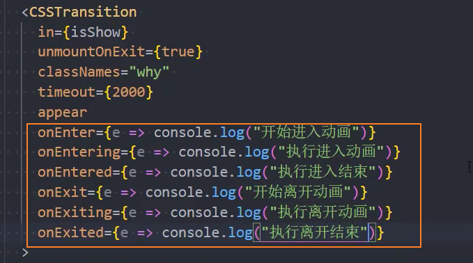
钩子函数
CSSTransition对应的钩子函数:主要为了检测动画的执行过程,来完成一些JavaScript的操作
onEnter:在进入动画之前被触发;
onEntering:在应用进入动画时被触发;
onEntered:在应用进入动画结束后被触发;
解决严格模式下使用CSSTrasition报警告的问题
问题:
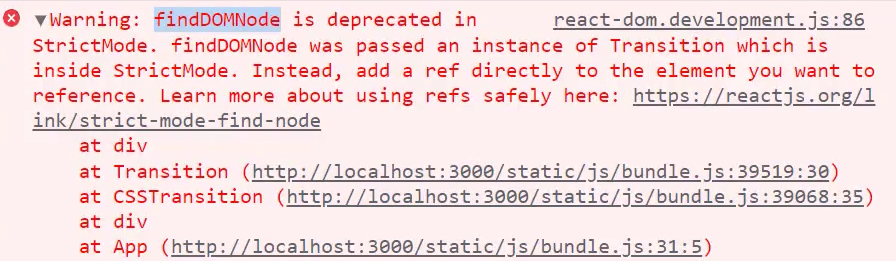
原因:这是因为findDOMNode是废弃API,严格模式下会报警告
解决:
- 1、主动设置
nodeRef属性,可以通过ref获取DOM组件,不必使用findDOMNode获取DOM元素
export class App extends PureComponent {
  constructor() {
    super()
    this.state = {
      isShow: true
    }
+    this.sectionRef = createRef()
  }
  render() {
    const { isShow } = this.state
    return (
      <div>
        <h3>App</h3>
        <hr />
        <button onClick={(e) => this.setState({ isShow: !isShow })}>切换</button>
        <StrictMode>
          <CSSTransition
            in={isShow}
            classNames="mr"
            unmountOnExit={true}
            timeout={2000}
            appear
+            nodeRef={this.sectionRef}
          >
+            <div ref={this.sectionRef}>我要执行动画~</div>
          </CSSTransition>
        </StrictMode>
      </div>
    )
  }
}- 2、关闭严格模式
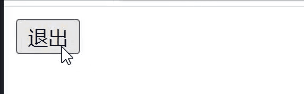
SwitchTransition
SwitchTransition可以完成两个组件之间切换的炫酷动画:
比如我们有一个按钮需要在on和off之间切换,我们希望看到on先从左侧退出,off再从右侧进入;
这个动画在vue中被称之为 vue transition modes;
react-transition-group中使用SwitchTransition来实现该动画;
语法
SwitchTransition中主要有一个属性:mode,有两个值
in-out:表示新组件先进入,旧组件再移除;
out-in:表示就组件先移除,新组建再进入;
基本使用
如何使用SwitchTransition呢?
SwitchTransition组件里面要有CSSTransition或者Transition组件,不能直接包裹你想要切换的组件;
SwitchTransition里面的CSSTransition或Transition组件不再像以前那样接受in属性来判断元素是何种状态,取而代之的是key属性;
key={isLogin ? 'exit' : 'login'} 是索引
export class App extends PureComponent {
  constructor() {
    super()
    this.state = {
      isLogin: true
    }
  }
  render() {
    const { isLogin } = this.state
    return (
      <div>
        <h3>App</h3>
        <hr />
+        <SwitchTransition mode="out-in">
+          <CSSTransition key={isLogin ? 'exit' : 'login'} classNames="mr" timeout={1000}>
            <button onClick={(e) => this.setState({ isLogin: !isLogin })}>
              {isLogin ? '退出' : '登录'}
            </button>
+          </CSSTransition>
+        </SwitchTransition>
      </div>
    )
  }
}css样式
/* 1. 进入动画 */
.mr-enter {
  opacity: 0;
  transform: translateX(100px);
}
.mr-enter-active {
  opacity: 1;
  transform: translateX(0);
  transition: all 1s ease;
}

/* 2. 离开动画 */
.mr-exit {
  opacity: 1;
  transform: translateX(0);
}
.mr-exit-active {
  opacity: 0;
  transform: translateX(-100px);
  transition: all 1s ease;
}
TransitionGroup
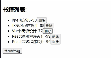
当我们有一组动画时,需要将这些CSSTransition放入到一个TransitionGroup中来完成动画:
属性
- component:
String Element,指定渲染的HTML元素
1、展示书籍列表
  constructor() {
    super()
    this.state = {
      books: [
        { id: 1, name: '三国演义', price: 88 },
        { id: 2, name: '水浒传', price: 77 },
        { id: 3, name: '西游记', price: 66 },
        { id: 4, name: '红楼梦', price: 55 },
      ]
    }
  }
  render() {
    const { books } = this.state
    return (
      <div>
        <h3>书籍列表</h3>
        <hr />
+        <TransitionGroup component="ul">
          {
+            books.map((item, index) => {
              return (
+                <CSSTransition key={item.id} classNames="book" timeout={1000}>
                  <li className='item'>
                    <span>{item.name}</span>
+                    <button onClick={e => this.removeBook(e, index)}>移除</button>
                  </li>
+                </CSSTransition>
              )
            })
          }
+        </TransitionGroup>
+        <button onClick={e => this.addBook(e)}>添加</button>
      </div>
    )
}2、添加书籍
通过设置最新且最大的id值,保证key始终是唯一的
  // 添加书籍
  addBook(e) {
    const newBooks = [...this.state.books]
    // 获取最新且最大的id索引值
    const ids = newBooks.map(item => {
      return item.id
    })
    const lastId = Math.max(...ids)
    // 生成book对象
    const book = {id: lastId + 1, name: '蜀山传', price: 33 }
    newBooks.push(book)
    this.setState({ books: newBooks })
}3、添加书籍-动画
.book-enter {
  opacity: 0;
  transform: translateX(100px);
}
.book-enter-active {
  opacity: 1;
  transform: translateX(0);
  transition: all 1s ease;
}4、删除书籍
  // 移除书籍
  removeBook(e, index) {
    console.log(e, index)
    const newBooks = [...this.state.books]
    newBooks.splice(index, 1)
    this.setState({ books: newBooks })
}5、删除书籍-动画
.book-exit {
  opacity: 1;
  transform: translateX(0);
}
.book-exit-active {
  opacity: 0;
  transform: translateX(-100px);
  transition: all 1s ease;
}6、注意:这执行删除动画时,如果key不唯一,会出现动画效果错乱
CSS
React中的CSS概述
组件化天下的CSS
前面说过,整个前端已经是组件化的天下:
- 而CSS的设计就不是为组件化而生的,所以在目前组件化的框架中都在需要一种合适的CSS解决方案。
在组件化中选择合适的CSS解决方案应该符合以下条件:
可以编写局部css:css具备自己的局部作用域,不会随意污染其他组件内的元素;
可以编写动态的css:可以获取当前组件的一些状态,根据状态的变化生成不同的css样式;
支持所有的css特性:伪类、动画、媒体查询等;
编写起来简洁方便、最好符合一贯的css风格特点;
等等...
React中的CSS
事实上,css一直是React的痛点,也是被很多开发者吐槽、诟病的一个点。
在这一点上,Vue做的要好于React:
Vue通过在.vue文件中编写
<style><style>标签来编写自己的样式;通过是否添加 scoped 属性来决定编写的样式是全局有效还是局部有效;
通过 lang 属性来设置你喜欢的 less、sass等预处理器;
通过内联样式风格的方式来根据最新状态设置和改变css;
等等...
Vue在CSS上虽然不能称之为完美,但是已经足够简洁、自然、方便了,至少统一的样式风格不会出现多个开发人员、多个项目采用不一样的样式风格。
相比而言,React官方并没有给出在React中统一的样式风格:
由此,从普通的css,到css modules,再到css in js,有几十种不同的解决方案,上百个不同的库;
大家一致在寻找最好的或者说最适合自己的CSS方案,但是到目前为止也没有统一的方案;
方案-内联样式
内联样式是官方推荐的一种css样式的写法:
style 接受一个采用小驼峰命名属性的 JavaScript 对象,而不是 CSS 字符串;
并且可以引用state中的状态来设置相关的样式;
内联样式的优点:
1.内联样式, 样式之间不会有冲突
2.可以动态获取当前state中的状态
内联样式的缺点:
1.写法上都需要使用驼峰标识
2.某些样式没有提示
3.大量的样式, 代码混乱
4.某些样式无法编写(比如伪类/伪元素)
所以官方依然是希望内联合适和普通的css来结合编写;
// 1. 方案:内联样式
export class App extends PureComponent {
  constructor() {
    super()
    this.state = {
+      size: 30
    }
  }
  render() {
    const { size } = this.state
    return (
      <div>
+        <div style={{color: 'red', fontSize: size + 'px', fontWeight: 700 }}>我是标题</div>
+        <div style={{backgroundColor: '#eee', padding: '10px'}}>我是内容~~</div>
      </div>
    )
  }
}方案-普通的CSS
普通的css我们通常会编写到一个单独的文件,之后再进行引入。
这样的编写方式和普通的网页开发中编写方式是一致的:
如果我们按照普通的网页标准去编写,那么也不会有太大的问题;
但是组件化开发中我们总是希望组件是一个独立的模块,即便是样式也只是在自己内部生效,不会相互影响;
但是普通的css都属于全局的css,样式之间会相互影响;
这种编写方式最大的问题是样式之间会相互层叠掉,没有作用域;
1、基本使用
  // 1. 引入css文件
+  import './App.css'

  export class App extends PureComponent {
    render() {
      return (
        <div>
          {/* 2. 设置class */}
+          <h3 className='title'>我是标题</h3>
+          <p className='content'>我是内容~~</p>
        </div>
      )
    }
}css样式文件
.title {
  color: orchid;
}
.content {
  padding: 10px;
  background: #ccc;
  border: 1px solid #f3f3f3;
}2、缺点:都是全局CSS,没有作用域
App组件
  export class App extends PureComponent {
    render() {
      return (
        <div>
          {/* 2. 设置class */}
          <h3 className='title'>我是标题</h3>
          <p className='content'>我是内容~~</p>

          {/* 3. 引入组件Home */}
          <hr />
+          <Home />
        </div>
      )
    }
}样式
.title {
+  color: orchid;
}
.content {
  padding: 10px;
+  background: #ccc;
  border: 1px solid #f3f3f3;
}Home组件
export class Home extends PureComponent {
  render() {
    return (
      <div>
        <div className='title'>我是Home组件的标题</div>
        <p className='content'>我是Home组件的内容~~~~</p>
      </div>
    )
  }
}样式
.title {
+  color: blue;
}
.content {
  padding: 10px;
+  background: skyblue;
  border: 1px solid #f3f3f3;
}效果
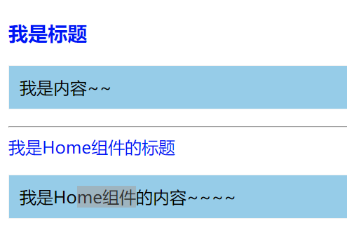
总结:Home组件和App组件都有 title 、 content 样式,从结果看是Home组件的样式覆盖了App组件的样式
方案-CSS Module
css modules并不是React特有的解决方案,而是所有使用了类似于webpack配置的环境下都可以使用的。
- 如果在其他项目中使用它,那么我们需要自己来进行配置,比如配置webpack.config.js中的modules: true等。
配置
React的脚手架已经内置了css modules的配置:
.css/.less/.scss 等样式文件都需要修改成 .module.css/.module.less/.module.scss 等;
之后就可以引用并且进行使用了;
css modules确实解决了局部作用域的问题,也是很多人喜欢在React中使用的一种方案。
缺陷
但是这种方案也有自己的缺陷:
引用的类名,不能使用连接符(.home-title),在JavaScript中是不识别的;
所有的className都必须使用*{style.className}* 的形式来编写;
不方便动态来修改某些样式,依然需要使用内联样式的方式;
如果你觉得上面的缺陷还算OK,那么你在开发中完全可以选择使用css modules来编写,并且也是在React中很受欢迎的一种方式。
+ import AppStyle from './App.module.css'

export class App extends PureComponent {
  render() {
    return (
      <div>
+        <div className={AppStyle.title}>我是标题</div>
+        <div className={AppStyle.content}>我是内容~~</div>
+        <div className={AppStyle.footerStyle}>我是尾部~~</div>
      </div>
    )
  }
}App.module.css
  .title {
    color: orchid;

  }
  .content {
    padding: 10px;
    background: #ccc;
    border: 1px solid #f3f3f3;
  }
+  .footerStyle {
    font-size: 30px;
}方案-Less
配置less的webpack
方案1、npm run eject 弹出webpack配置,然后手动修改
方案2、安装包: craco
- 安装
craco
npm i @craco/craco问题: 安装的时候如果出现和create-react-app的版本不匹配可以去github的issue上找解决办法,安装 @craco/craco@alpha 版本
npm i @craco/craco@alpha- 修改scripts脚本
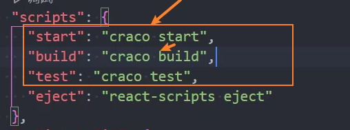
- 安装
craco-less
npm i craco-less@alpha- 新建
craco.config.js文件,配置webpack
const CracoLessPlugin = require("craco-less");

module.exports = {
  plugins: [
    {
      plugin: CracoLessPlugin,
      options: {
        lessLoaderOptions: {
          lessOptions: {
            modifyVars: {
              "@primary-color": "#1DA57A"
            },
            javascriptEnabled: true,
          },
        },
      },
    },
  ],
};基本使用
+ import './App.less'

export class App extends PureComponent {
  render() {
    return (
      <div>
+        <div className="section">
+          <div className="title">我是标题</div>
+          <div className="content">我是文章内容~</div>
+          <a className='link' href="#">百度一下</a>
        </div>
      </div>
    )
  }
}样式
// 1. 定义变量
@primaryColor: red;

.section {
  border: 1px solid #eee;
  padding: 10px;

  .title {
    font-weight: 700;
    // 1. 使用变量
    color: @primaryColor;
  }

  .content {
    size: 14px;
    background: skyblue;
  }

  .link {
    color: #333;
    // 2. 使用伪类
    &:hover {
      color: @primaryColor;
    }
  }
}方案-CSS in JS【推荐】
认识CSS in JS
官方文档也有提到过CSS in JS这种方案:
“CSS-in-JS” 是指一种模式,其中 CSS 由 JavaScript 生成而不是在外部文件中定义;
注意此功能并不是 React 的一部分,而是由第三方库提供;
React 对样式如何定义并没有明确态度;
在传统的前端开发中,我们通常会将结构(HTML)、样式(CSS)、逻辑(JavaScript)进行分离。
但是在前面的学习中,我们就提到过,React的思想中认为逻辑本身和UI是无法分离的,所以才会有了JSX的语法。
*样式呢?*样式也是属于UI的一部分;
事实上CSS-in-JS的模式就是一种将样式(CSS)也写入到JavaScript中的方式,并且可以方便的使用JavaScript的状态;
所以React又被人称之为 All in JS;
当然,这种开发的方式也受到了很多的批评:
- Stop using CSS in JavaScript for web development
- https://hackernoon.com/stop-using-css-in-javascript-for-web-development-fa32fb873dcc
styled-components
批评声音虽然有,但是在我们看来很多优秀的CSS-in-JS的库依然非常强大、方便:
CSS-in-JS通过JavaScript来为CSS赋予一些能力,包括类似于CSS预处理器一样的样式嵌套、函数定义、逻辑复用、动态修改状态等等;
虽然CSS预处理器也具备某些能力,但是获取动态状态依然是一个不好处理的点;
所以,目前可以说CSS-in-JS是React编写CSS最为受欢迎的一种解决方案;
目前比较流行的CSS-in-JS的库有哪些呢?
styled-components
emotion
glamorous
目前可以说styled-components依然是社区最流行的CSS-in-JS库,所以我们以styled-components的讲解为主;
安装
安装styled-components:
npm i styled-components
# 或者
yarn add styled-componentsES6标签模板字符串
ES6中增加了模板字符串的语法,这个对于很多人来说都会使用。
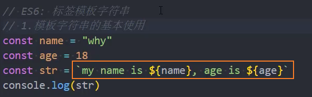
但是模板字符串还有另外一种用法:标签模板字符串(Tagged TemplateLiterals)。
我们一起来看一个普通的JavaScript的函数:
- 正常情况下,我们都是通过
函数名()方式来进行调用的,其实函数还有另外一种调用方式:
// 标签模板字符串
function foo(...args) {
  console.log(args)
}

// 使用模板字符串调用函数 - 基本使用
+ foo`Hello` // => ['Hello', raw: Array(1)]

// 使用模板字符串调用函数 - 调用时传入变量
const name = 'Tom'
const age = 18
+ foo`Hello ${name}, age is ${age}` // => [['Hello ', ', age is ', '', raw: Array(3)], 'Tom', 18]如果我们在调用的时候插入其他的变量:
模板字符串被拆分了;
第一个元素是数组,是被模块字符串拆分的字符串组合;
后面的元素是一个个模块字符串传入的变量内容;
在styled component中,就是通过这种方式来解析模块字符串,最终生成我们想要的样式的
sc-基本使用
styled-components的本质是通过函数的调用,最终创建出一个组件:
这个组件会被自动添加上一个不重复的class;
styled-components会给该class添加相关的样式;
支持类似于CSS预处理器一样的样式嵌套:
支持直接子代选择器或后代选择器,并且直接编写样式;
可以通过&符号获取当前元素;
直接伪类选择器、伪元素等;
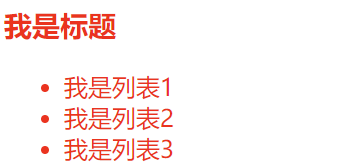
  // 1. 引入styled
+  import styled from 'styled-components'

  // 2. 使用styled设置样式,并将样式赋值给组件AppWrapper
+  const AppWrapper = styled.div`
+    color: red;
+  `

  export class App extends PureComponent {
    render() {
      return (
        // 3. 使用组件AppWrapper包裹需要设置样式的代码
+        <AppWrapper>
          <h3>我是标题</h3>
          <ul>
            <li>我是列表1</li>
            <li>我是列表2</li>
            <li>我是列表3</li>
            <li>我是列表4</li>
            <li>我是列表5</li>
          </ul>
+        </AppWrapper>
      )
    }
  }
插件:高亮CSS样式
插件: vscode-styled-components
效果:
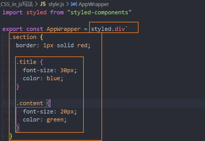
sc-单独抽取子元素
  // 1. 引入styled
+  import styled from 'styled-components'

  // 2. 定义CSS样式
+ const AppSC = styled.div`
+    color: blue;
    .app-title {
      font-size: 30px;
    }
  `
+ const ContentSC = styled.div`
    .content-title {
      font-size: 20px;
    }
    .list {
      padding: 10px;
      .item {
        background: #eee;
+        color: red; // 覆盖app中的样式
      }
    }
  `

  export class App extends PureComponent {
    render() {
      return (
        // 3. 使用CSS样式
+        <AppSC>
          <h3 className='app-title'>我是App标题</h3>
+          <ContentSC>
            <h3 className='content-title'>我是Content</h3>
            <ul className='list'>
              <li className='item'>我是列表1</li>
              <li className='item'>我是列表2</li>
              <li className='item'>我是列表3</li>
              <li className='item'>我是列表4</li>
            </ul>
+          </ContentSC>
+        </AppSC>
      )
    }
}sc-接收外部传入的props,添加attrs属性
props可以传递

props可以被传递给styled组件
获取props需要通过${}传入一个插值函数,props会作为该函数的参数;
这种方式可以有效的解决动态样式的问题;
添加attrs属性
错误的写法:获取不到默认值
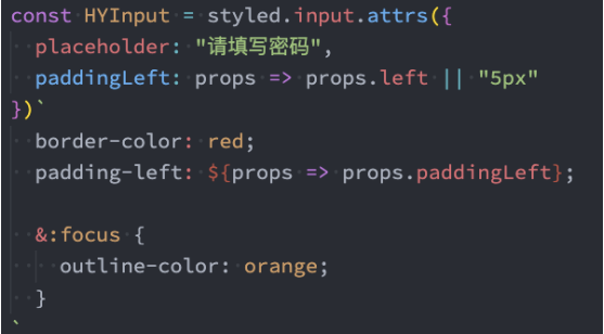
正确的写法:可以获取默认值
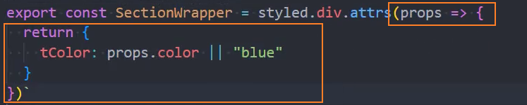
示例:基本使用
接收外部传入的props
  import styled from 'styled-components'

  // 样式
  // 在sc组件中接收外部传递的props
  const AppSC = styled.div`
    .title {
+      font-size: ${props => props.size}px;
    }
    .content {
+      color: ${props => props.color}
    }
  `

  export class App extends PureComponent {
    constructor() {
      super()
      this.state = {
+        size: 30,
+        primaryColor: 'red'
      }
    }
    render() {
      const { size, primaryColor } = this.state
      return (
+        <AppSC size={size} color={primaryColor} >
          <div className="title">我是标题</div>
          <div className="content">我是内容</div>
          <ul className="list">
            <li className='item'>我是列表1</li>
            <li className='item'>我是列表2</li>
            <li className='item'>我是列表3</li>
          </ul>
        </AppSC>
      )
    }
}sc-引入外部变量
1、定义通用样式并导出
export const primaryColor = 'blue'
export const defaultColor = '#333'

export const smallSize = '12px'
export const normalSize = '14px'
export const largeSize = '24px'2、在CSS文件中引入通用样式
  // 引入外部变量
  import * as v from './common'
  // 或者
import { primaryColor, defaultColor, smallSize } from './common'3、使用变量
  const AppWrapper = styled.div`
    .title {
+      font-size: ${v.largeSize};
+      color: ${v.primaryColor};
    }
    .content {
      padding: 10px;
    }
    .list {
      .item {
+        font-size: ${v.smallSize};
      }
    }
`sc-高级特性
支持样式的继承
  import styled from 'styled-components'

  // 样式
  // 1. 父样式
+  const ButtonWrapper = styled.button`
    border: none;
  `
  // 2. 子样式
+  const ButtonWarnWrapper = styled(ButtonWrapper)`
    font-size: 20px;
    padding: 5px 10px;
  `


  // 组件
  export class App extends PureComponent {
    render() {
      return (
        // 3. 使用子样式:ButtonWarnWrapper
+        <ButtonWarnWrapper>我是按钮</ButtonWarnWrapper>
      )
    }
}styled设置主题
+  import styled, { ThemeProvider } from 'styled-components'

  export class App extends PureComponent {
    render() {
      return (
        <div>
          {/* 1. 父组件:设置主题样式 */}
+          <ThemeProvider theme={{color: 'blue', size: '30px'}}>
+            <Home />
+          </ThemeProvider>
        </div>
      )
    }
  }

  const HomeSC = styled.div`
    /* 2. 子组件:使用传递过来的主题样式 */
+    color: ${props => props.theme.color};
+    font-size: ${props => props.theme.size};
  `
  class Home extends PureComponent {
    render() {
      return (
        <HomeSC>Home</HomeSC>
      )
    }
}classnames库
vue中添加class
vue中添加class是一件非常简单的事情:
你可以通过传入一个对象:
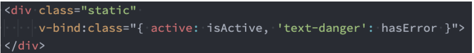
你也可以传入一个数组:

甚至是对象和数组混合使用:

React中添加class
React在JSX给了我们开发者足够多的灵活性,你可以像编写JavaScript代码一样,通过一些逻辑来决定是否添加某些class:
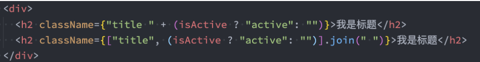
这个时候我们可以借助于一个第三方的库:classnames
这是一个用于动态添加classnames的一个库。
安装
npm i classnames基本使用
classNames('foo', 'bar'); // => 'foo bar'
classNames('foo', { bar: true }); // => 'foo bar'
classNames({ 'foo-bar': true }); // => 'foo-bar'
classNames({ 'foo-bar': false }); // => ''
classNames({ foo: true }, { bar: true }); // => 'foo bar'
classNames({ foo: true, bar: true }); // => 'foo bar'
classNames('foo', { bar: true, duck: false }, 'baz', { quux: true }); // => 'foo bar baz quux'
classNames(null, false, 'bar', undefined, 0, 1, { baz: null }, ''); // => 'bar 1'
classNames('a', ['b', { c: true, d: false }]); // => 'a b c'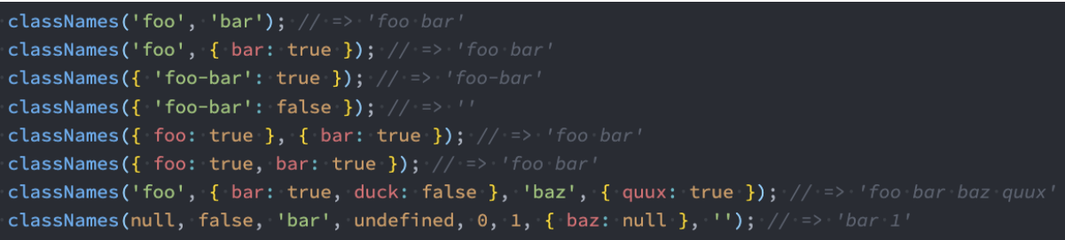
+ import { AppSC } from './style'
+ import classNames from 'classnames'

export class App extends PureComponent {
  render() {
    return (
      <AppSC>
+        <div className={classNames(['fontSize', 'color'])}>我是标题-数组形式</div>
+        <div className={classNames({fontSize: true, color: false})}>我是标题-对象形式</div>
+        <div className={classNames(['fontSize', {color: true}])}>我是标题-数组 + 对象形式</div>
+        <div className={classNames([null, '', false, {}, [], 1, 0,  'fontSize', {color: true}])}>我是标题-值为空</div>
      </AppSC>
    )
  }
}样式:
import styled from "styled-components";

const primaryColor = 'blue';

export const AppSC = styled.div`
  .fontSize {
    font-size: 20px;
  }
  .color {
    color: ${primaryColor};
  }
`